
Advertisement
Click to download now, finish the installation quickly, and directly unlock the "all-round experience"
Advertisement
Screenshots
Click to download now, finish the installation quickly, and directly unlock the "all-round experience"
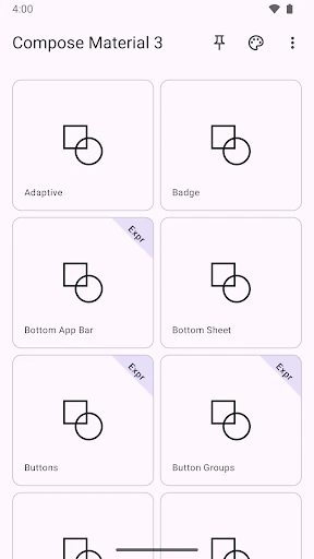
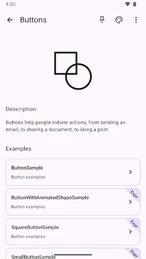
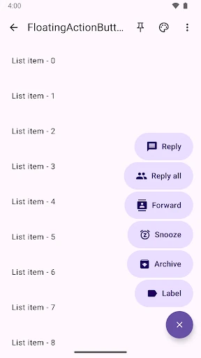
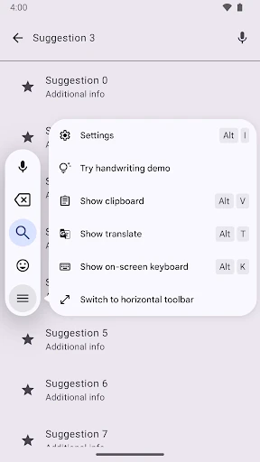
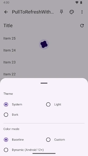
The Compose Material Catalog serves as the definitive, canonical reference for developers and designers operating within the Jetpack Compose ecosystem. Positioned as a premier entry in the Libraries & Demo category, this application functions as a living specification for Material Design implementation. By providing a tangible bridge between design theory and functional code, it allows users to witness the behavior of theming, dark mode, and component interactions in real-time. It is an essential utility for anyone seeking to master the modern Android UI toolkit with professional-grade precision.
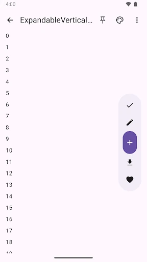
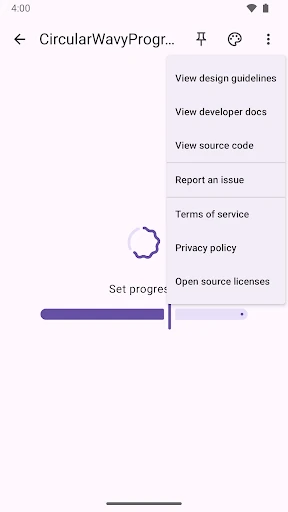
The user interface of the Compose Material Catalog is a masterclass in "eating your own dogfood." Built using the very Jetpack Compose components it showcases, the app provides a fluid, responsive, and intuitive experience. The navigation is intentionally minimal, allowing the components themselves to take center stage. For a Libraries & Demo application, the UX is exceptionally polished, featuring smooth transitions and a clean layout that adheres strictly to the latest Material Design guidelines, making it both a tool and a design inspiration.
To further elevate its utility, the next update should consider integrating a "Source Code" view for each component, allowing developers to copy-paste implementation logic directly from the app. Additionally, adding a "Constraints" or "Properties" panel where users could toggle boolean flags (like enabled/disabled states or icon placement) in real-time would greatly enhance its value as a prototyping reference tool.
The Compose Material Catalog is a must-have for Android developers, UI/UX designers, and product managers working with Jetpack Compose. It serves as a vital bridge between design mockups and technical implementation. While primarily a demonstration tool, its role in standardizing Material Design across the Android platform cannot be overstated. We highly recommend this app as a permanent fixture on any developer's test device.